The NBA season is now in full swing. Like many other sports these days, the NBA has been going through a significant change in the way the game is played.
Much of this change can be attributed to the ‘advanced analytics’ movement — you know, Moneyball stuff (or Moreyball, for those of us NBA nerds). There are so many great statistics out there to measure your favourite team and player’s performances these days, and visualisation tools to communicate them.
In this article, I use Python, Pandas and Matplotlib to manipulate, analyse and visualise NBA statistics (primary shot charts). A lot of this data is quite accessible (freely or at a relatively low cost), so you should be able to have a go at analysing this data yourself.
Shot data visualisation
As an entry point, let’s take a look at shot data. The object of the game is to score. And to facilitate that, you want to be creating as many high quality (high-percentage) shots as possible. So, looking at shot data is a natural gateway to deploying data analytics to basketball.
Personally, this is a bit of a tribute to the website Grantland (RIP), and Kirk Goldsberry. When I first saw these charts, I absolutely fell in love with their simplicity and visual power.
 Shot chart by Kirk Goldsberry (Grantland)
In one graph, one team’s entire season’s worth of shots are plotted. It shows the location of shots, their relative frequency compared to other spots, and the efficiency from each location compared to the rest of the league, all in a way that is intuitive and informative. Data visualisation rarely gets better than this.
Shot chart by Kirk Goldsberry (Grantland)
In one graph, one team’s entire season’s worth of shots are plotted. It shows the location of shots, their relative frequency compared to other spots, and the efficiency from each location compared to the rest of the league, all in a way that is intuitive and informative. Data visualisation rarely gets better than this.
So over the next few posts, we’re going to work up to recreating charts similar to these, but with more modern data. But first, let’s start at the beginning.
Note – I assume some familiarity with python, pandas and matplotlib. But it’s probably not that difficult to follow if you’ve got at least some python experience.
Obtaining our data
What you will need to create these lovely charts is a dataset that contains at a all the shots that you want to put into a graph. The dataset needs to include for each shot its x & y coordinates, player name, and whether the shot was made or missed.
For me, I just bought a season’s data from this site. I got the play-by-play data, which includes every single play from each game — categorised where possible, and including descriptions of the play.
If you are looking to just test scripts, BigDataBall provides a demo dataset, which you should be able to download and follow along with this.
Importing & cleaning the data
I’ve got my data in csv format, which can be loaded straight into a dataframe – so that is exactly what I did.
import pandas as pd
logpath = [CSV DATA FILE PATH]
log_df = pd.read_csv(logpath)
We are interested in just the shots — so we would like to filter the dataframe. Looking at the data with log_df.columns — we find the ‘event_type’ column. Let’s see if that’s the column that we are after — I print its unique values by:
print(log_df.event_type.unique())I see that there is a ‘shot’ value and a ‘miss’ value — fantastic. Using this, I can build a filtered dataframe, with a filter where the event_type parameter is a 'shot' or a 'miss' .
shots_df = log_df[(log_df.event_type == 'shot') | (log_df.event_type == 'miss')]Just like that, we have a filtered dataframe!
Well, one last thing — let’s build a new column where we’ve got a binary classification (1/0) where 1 is for a made shot, and 0 for misses. It will come in handy rather than having to filter by a string variable.
I did it by creating a new column with a zero value, and using the .maskdataframe method to give the values where the 'event_type' column value is a 'shot' .
shots_df['shot_made'] = 0
shots_df['shot_made'] = shots_df['shot_made'].mask(shots_df.event_type == 'shot', 1)
Okay, great. Oh — if you’re loading multiple files, all you have to do is to load them all, add them to a list and then use pd.concat.
For example, if temp_list is your list of dataframes, you could addthem all together by: pd.concat(temp_list, axis=0, ignore_index=True).
Boring — plot me something
Okay, okay. Let’s get to the fun part. Actually, now that all the work has been done, the plotting part is extremely easy. Let’s take a look at all of the shot attempts in the October 20th, 2018 game between the Spurs and the Trail Blazers.
shots_df as filtered includes 184 rows — and looking at Basketball-reference.com box score tells me this is correct. How do we plot them?
Well, let’s start with a simple scatter plot — the coordinates are already there, so a simple shots_df.plot.scatter('original_x', 'original_y') will actually plot all the shots!… as ugly as it might be.
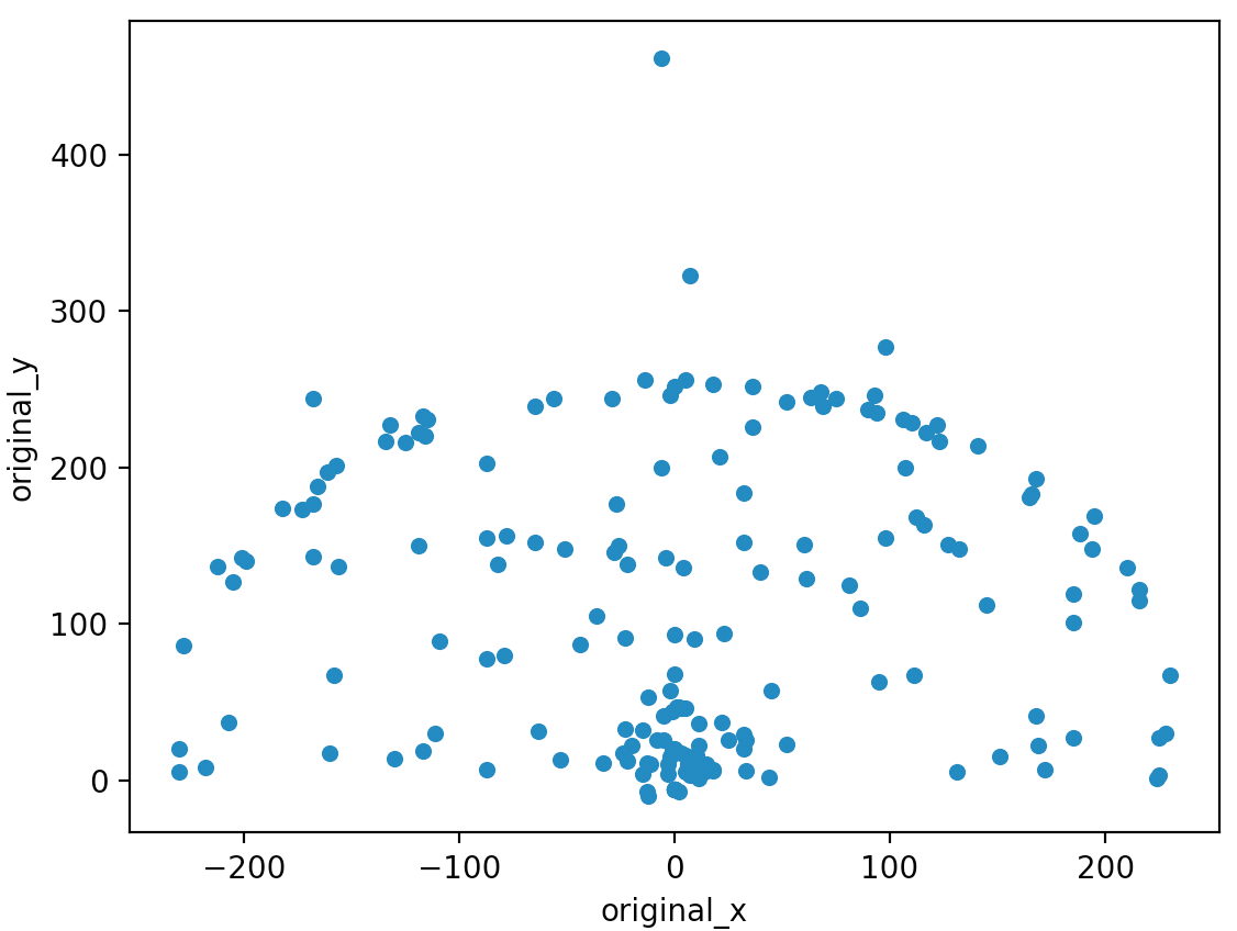 My first shot chart (yes, it’s not pretty)
If you squint, you can kind of see the paint area and the 3-point arc. But without the court lines, it’s pretty terrible, the ratio seems wrong, the axes are not necessary, and we can’t even tell which ones are misses and which ones are makes! Let’s fix all of those things.
My first shot chart (yes, it’s not pretty)
If you squint, you can kind of see the paint area and the 3-point arc. But without the court lines, it’s pretty terrible, the ratio seems wrong, the axes are not necessary, and we can’t even tell which ones are misses and which ones are makes! Let’s fix all of those things.
Drawing the court
Luckily, matplotlib allows drawing on the window with .patches. You can draw whatever you want with patches — even these absolutely random shapes, which is in the documentation for some reason.
But the point is, you can draw the court with a combination of arcs, lines, and circles. This excellent tutorial provides the code. It’s excellent, and I simply reused the code instead of reinventing the wheels. I’ve kept the function name, too, which is called: draw_court
Encoding makes/misses
This is the moment where the 'shot_made' column that we created above comes handy. We can simply assign these values as colours in the scatter plot by passing this column to the 'c' parameter in a scatter plot using matplotlib.
The chart now visually indicates which shot attempts were misses and which were made field goals.
If you try this out, you’ll notice that the default colour maps are quite hideous — so I looked through these available colourmaps, and chose coolwarm_r ('_r' denotes reversed colourmaps, to encode the made shots as blue). You can see a tutorial here including the list of colourmaps.
Fix court ratio
Matplotlib allows you to specify the output dimensions of your plot, with the figsize parameter of the figure function.
Given that the court dimensions are 94 by 50 feet, and we are drawing a half court, we will use some variation of the 47:50 ratio (or close to it). Also, the 50 is the ‘x’ dimension in this case – so it might be more like 50:47.
So, we can achieve this with: plt.figure(figsize(5, 4.7))
Note: If you are wondering what plt is, it’s the usual abbreviation for matplotlib.pyplot — imported as plt:
import matplotlib.pyplot as pltHide axes
We can use the .gca() method in matplotlib to get the axes object for the current plot — and simply using .axes.get_xaxis().set_visible(False) (or yaxis in place of xaxis) will hide the axis — ticks and all.
Show me the plot!
Putting it all together, we can generate our improved shot chart with:
plt.figure(figsize=(5, 4.7))
plt.scatter(shots_df.original_x, shots_df.original_y, c=shots_df.shot_made, cmap='coolwarm_r')
draw_court(outer_lines=False)
cur_axes = plt.gca()
cur_axes.axes.get_xaxis().set_visible(False)
cur_axes.axes.get_yaxis().set_visible(False)
plt.xlim(250, -250)
plt.ylim(-47.5, 422.5)
plt.show()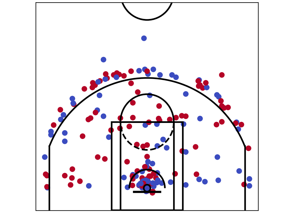 Shot chart for the whole game
And there it is, the shot chart for the whole game. But – wait, that’s the shot chart for both teams. Let’s start to break these down and compare the teams and players.
Shot chart for the whole game
And there it is, the shot chart for the whole game. But – wait, that’s the shot chart for both teams. Let’s start to break these down and compare the teams and players.
Shot charts — POR vs SAS
Now that we have everything we need to plot shot charts, it’s just a matter of filtering our dataframe and passing it through the same process.
Looking at the ‘team’ column with print(shots_df.team.unique()), shows ‘SAS’ and ‘POR’ as the only two values, so we can filter by those. For instance, we can get San Antonio’s shots by:
sas_shots_df = shots_df[shots_df.team == 'SAS']
And we can generate the shot charts using the same process as above. Oh, let’s add a little bit of text to clarify which is which. Given our coordinate system, I can plot a little bit of text on the top left using
plt.text(220, 370, 'Shot chart: ' + teamname)And so — they look like this:
 SAS vs POR — respective shot charts
Getting an individual player’s shot chart.
Lastly, let’s take a look at generating individual shot charts. We’ll pick the top two players from each team to generate shot charts for (and show them together).
Once again, it’s just a matter of filtering the data — this time with players’ names. Since we want to filter for multiple people, we once again use the ‘or’ operator in dataframe filtering, which is a pipe (|).
To filter for LaMarcus Aldridge and DeMar DeRozan of the Spurs, use:
pl_shots_df = shots_df[(shots_df.player == 'LaMarcus Aldridge') | (shots_df.player == 'DeMar DeRozan')]And we can do similarly for Damian Lillard & CJ McCollum of the Trail Blazers.
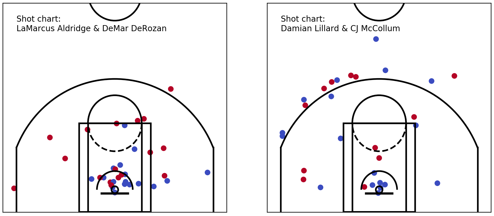 Looks great, right? Except for all the midrange shots taken by the Spurs’ big two… but that’s a story for another day.
Let’s stop there for now. But with one thought — what would these shot charts look like, if they included charts from multiple games — even an entire season? Could you make much of it? How could you compare one player’s, or team’s, shot chart vs another and get meaningful information out of it?
That’s where these hexbin plots like these ones comes in handy.
 The next article discusses these bad boys. What they are, why they’re useful (even outside of sports — they’re used a lot in election coverage, too) and how to generate them.
 Hexbins in election coverage (Information is beautiful / fivethirtyeight)
For updates, follow me on twitter.
Update: The next article is up, and you can read it here.