Problems with raw shot charts
In the last article, we talked about how to generate shot charts for individual games, teams and players using python, pandas and matplotlib.
Now, imagine that you want to see how a team or a player performs over the course of the season. Data from just one game, or even a few games, is limited in size and likely to be unrepresentative of their true ability. So, what you might want to look at would be a larger sample size of shots, maybe by looking at the entire season’s worth of shots.
But a player might take hundreds, or thousands of shots over the course of a 82-game season. James Harden attempted over a THOUSAND three pointers in the 2018–2019 season. Ploting all of that is possible, but just ends up in a huge mess. Take a look at this:
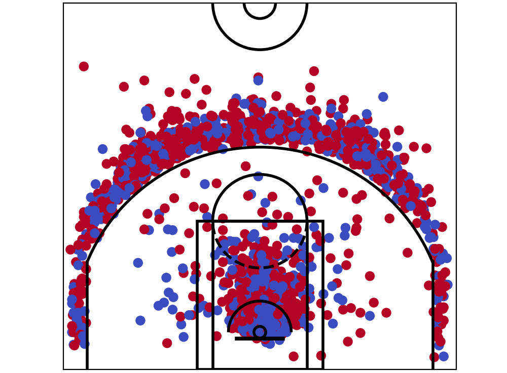 All of James Harden’s shots from 2018/19 season. It’s just a *little bit *confusing.
You can kind of see what’s going on, but it is not easy to make much of it in detail. It’s just a huge mess, with dots **everywhere**. How could we improve upon this?
All of James Harden’s shots from 2018/19 season. It’s just a *little bit *confusing.
You can kind of see what’s going on, but it is not easy to make much of it in detail. It’s just a huge mess, with dots **everywhere**. How could we improve upon this?
Histograms
Before we talk about exactly how to solve our problem in plotting basketball shot data, let’s step back a bit. I’m going to tall instead about histograms, and how it solves similar problems.
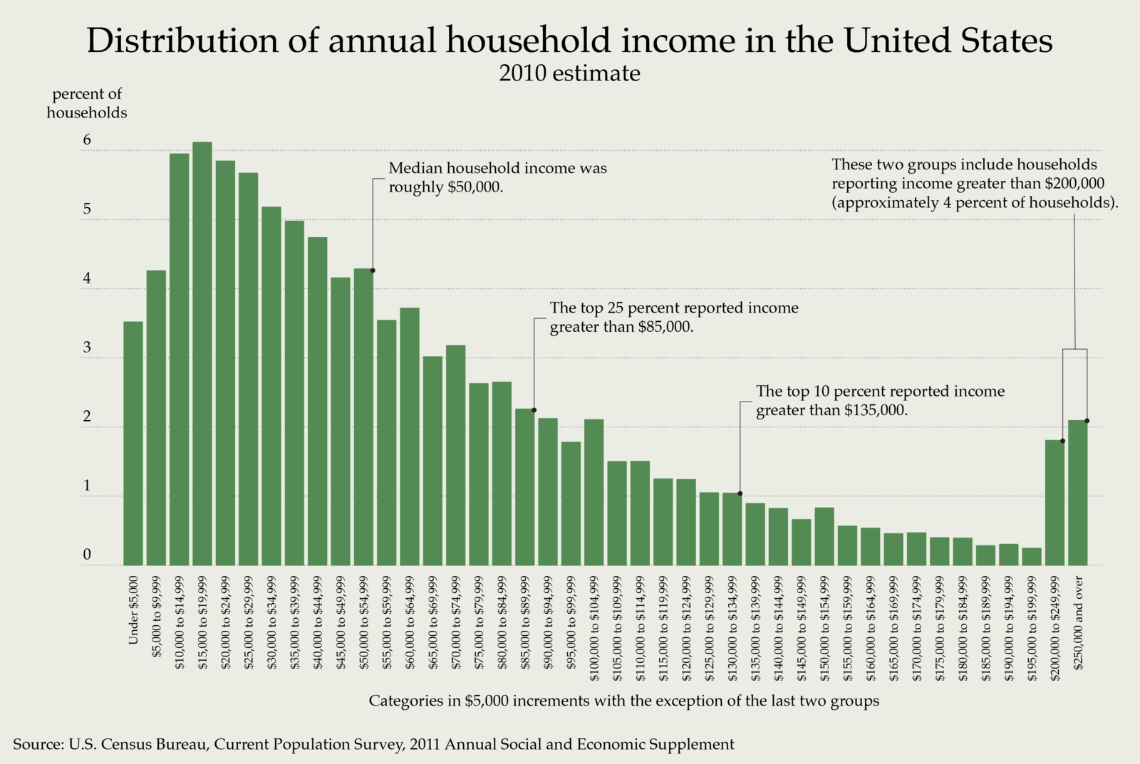
A histogram shows the distribution of data, usually along one dimension (exam marks, heights, incomes, whatever). Let’s say you would like to look at data of household income. Using a histogram, instead of plotting tens or hundreds of thousands of data points and looking for trends, we can simply group similar data together.
In statistics, and with histograms, these group are called ‘bins’. Imagine sorting a million balls into various ‘bins’ by whatever category you’re interested in. That’s what a histogram does. In the case of household income, a natural choice is by different bands of income amount, arriving at a graph like this one:
 Histogram of annual household income (Wikipedia)
You’d agree that this is much better than looking at hundreds of thousands of dots in a graph and trying to figure out what percentage of them is between $40,000 and $44,999 for instance.
Histogram of annual household income (Wikipedia)
You’d agree that this is much better than looking at hundreds of thousands of dots in a graph and trying to figure out what percentage of them is between $40,000 and $44,999 for instance.
Hexbin plots (2d histograms)
With that in mind, could we do something similar with our shot data, grouping shots into ‘bins’? And what variable should we choose to do it?
Well, the answer is yes, and to choose two variables initially, x and ycoordinates. In plain language, we’re going to subdivide the court into lots of tiny blocks, and assign each shot to one of these blocks.
For mathematical reasons, these blocks are going to be in shapes of hexagons (read this if you’re interested in why — the short answer is that it reduces biasing effects).
Using hexbins, we could divide up the basketball court to ‘bins’. And we can present more information this way — remember Kirk Goldsberry’s charts that we looked at in my previous post? Here’s another one.
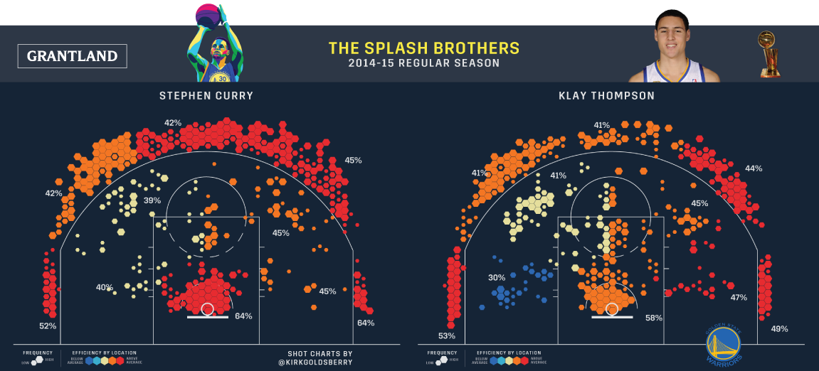 The Splash Brothers’ shot charts (Grantland)
You’ll notice that as well as there being a whole lot of hexagonal shapes, that some of these hexagons are different sizes to each other, and coloured differently to each other. This way, each hexagon cleverly encodes fourdimensions of information — x axis and y axis of the shots, shot volume, and shot accuracy.
The Splash Brothers’ shot charts (Grantland)
You’ll notice that as well as there being a whole lot of hexagonal shapes, that some of these hexagons are different sizes to each other, and coloured differently to each other. This way, each hexagon cleverly encodes fourdimensions of information — x axis and y axis of the shots, shot volume, and shot accuracy.
Exciting, isn’t it? Okay — enough theory for now. Let’s get to plotting.
Back to python
Blank hexbin plots
To plot hexbins, we need to get Python to divide up the area, plot centroids, and assign each points to a bin, before calculating each bin’s value.
Luckily, matplotlib already provides a function to deal with hexbins and all its related goodness. Simply using the plt.hexbin function (reference) for the most part automates these tasks.
To begin with, let’s create a ‘blank’ honeycomb graph that we see above.
For this part, we do not need real data. In fact, we want all the honeycomb ‘cells’ (hexagons) to be the same colour — so what we’ll do is to distribute points throughout the court, and give each cell zero values.
Each point needs a coordinate value — so if we have nx points along the x-axis, and ny points along the y-axis, we’ll end up with nx * ny points in the area. I chose to do this by simply looping through two ranges, where each range is the coordinate system’s ends.
# create lists of x / y coordinate values for each point
x_coords = list()
y_coords = list()
# iterate through x & y ranges
for i in range(-250, 250, 5):
    for j in range(-47.5, 422.5, 5):
        x_coords.append(i)
        y_coords.append(j)
Then the hexbin plot can be plotted using plt.hexbin. Here, we specify values of 0 for each cell with the parameter C, giving it a value of [0] * len(x_coords) and use ‘Blues’ colormap, where the zero values will show up as white. Lastly, I assign ‘Orange’ to the edgecolors parameter so that the edges are visible and orange for this exercise.
The rest of the code will be familiar from the last post. Putting it together, this plots our hexbins:
x_coords = list()
y_coords = list()
for i in range(-250, 250, 5):
for j in range(-48, 423, 5):
x_coords.append(i)
y_coords.append(j)
plt.figure(figsize=(5, 4.7))
plt.xlim(250, -250)
plt.ylim(-47.5, 422.5)
plt.hexbin(x=x_coords, y=y_coords, C=[0] * len(x_coords), gridsize=40, edgecolors='Orange', cmap='Blues')
viz.draw_court(outer_lines=True)
cur_axes = plt.gca()
cur_axes.axes.get_xaxis().set_visible(False)
cur_axes.axes.get_yaxis().set_visible(False)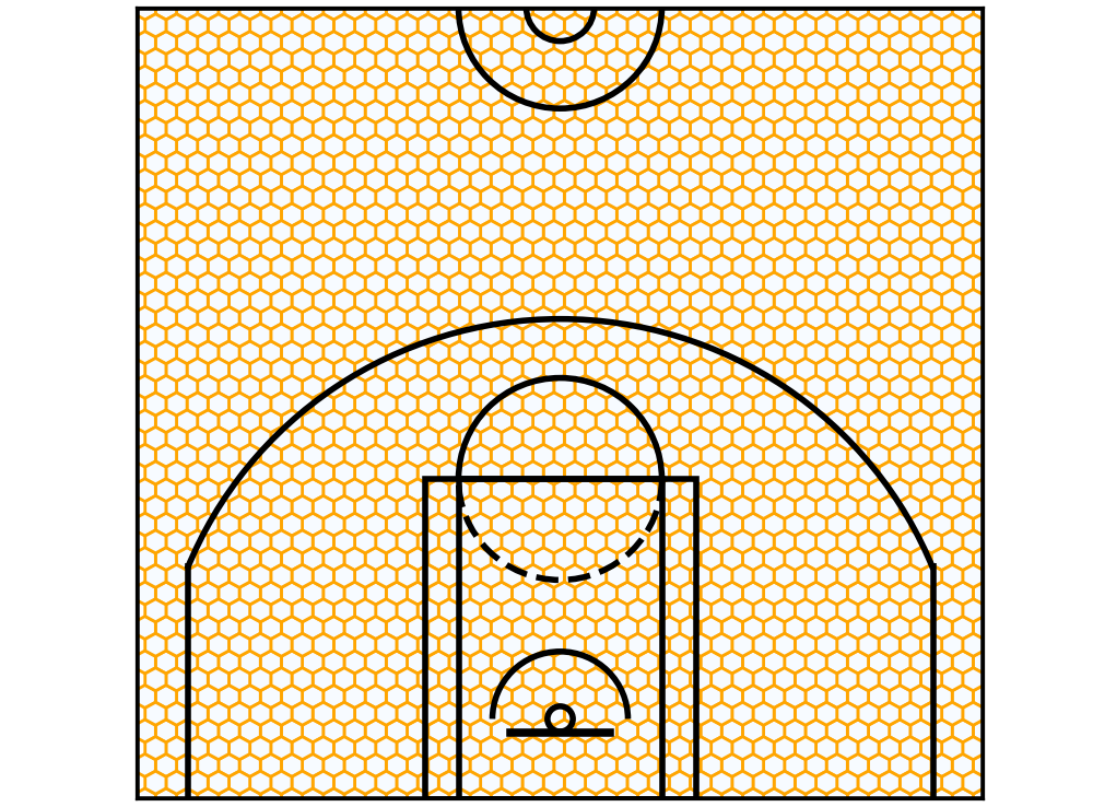 Et Voila! The hexbins are plotted.
Neat, huh? Let’s stick some actual data into it.
Et Voila! The hexbins are plotted.
Neat, huh? Let’s stick some actual data into it.
Hexbins with in-game data
Remember that Spurs game we looked at in the last article? Their shot chart looked like this:
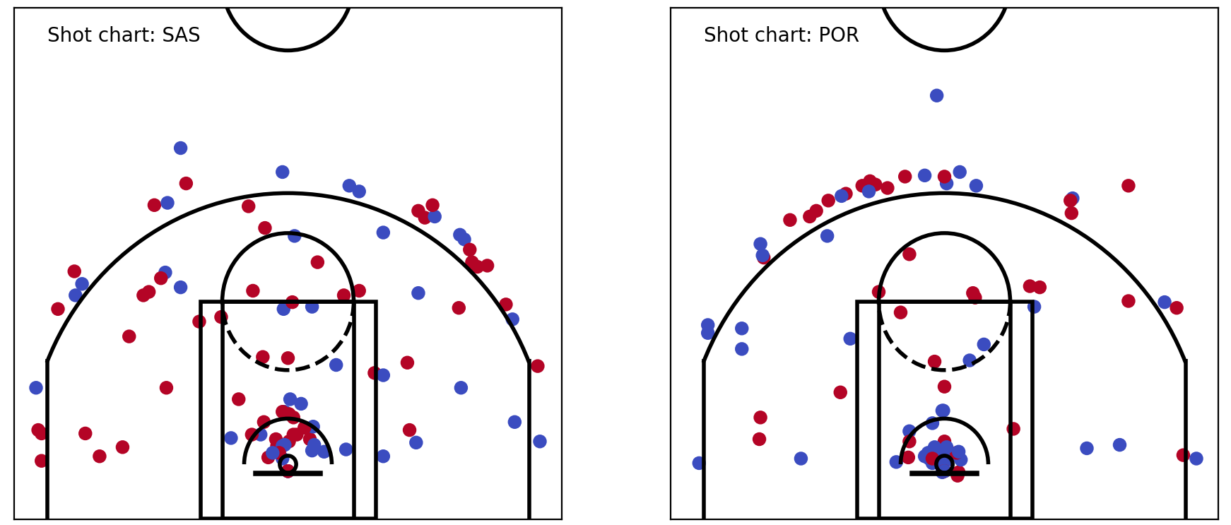 SAS vs POR shot chart
Let’s try putting this data into our hexbins. To do this, I pass the x, y coordinates from the shots_df dataframe, and the ‘shot_made’ column (0 or 1) as the colour.
SAS vs POR shot chart
Let’s try putting this data into our hexbins. To do this, I pass the x, y coordinates from the shots_df dataframe, and the ‘shot_made’ column (0 or 1) as the colour.
plt.hexbin(x=shots_df.original_x, y=shots_df.original_y, C=shots_df.shot_made, gridsize=40, edgecolors='Orange', cmap='Blues')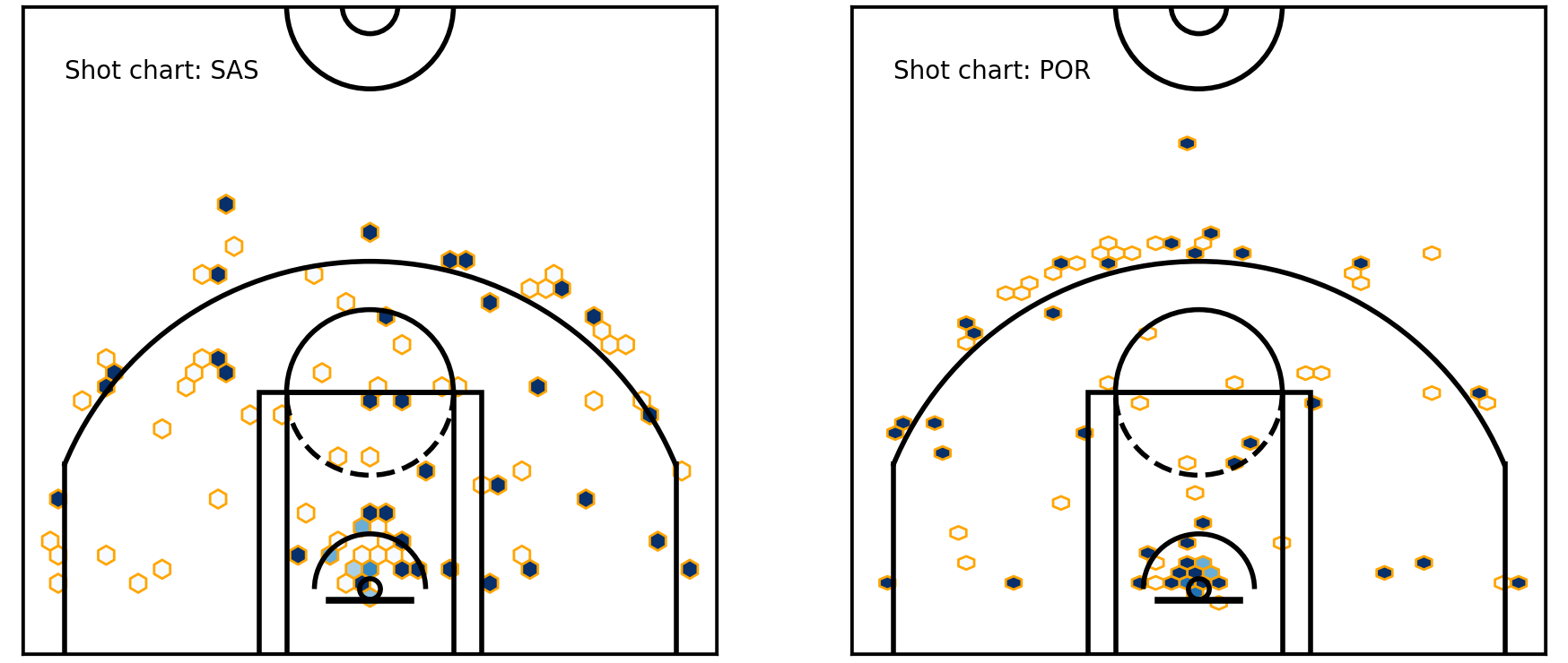 Shot chart — into hexbins
Okay, that’s great. But I notice a few things here. There are precious few hexagons, firstly. And secondly, the data looks more or less the same as the raw shot chart above. Well, that’s because we’re dealing with relatively small sample sizes. Each hexagon mostly contains one shot only — and that means that it’ll have a 100% (1/1) or 0% (0/1) accuracy. But near the rim, we start to see gradations.
Shot chart — into hexbins
Okay, that’s great. But I notice a few things here. There are precious few hexagons, firstly. And secondly, the data looks more or less the same as the raw shot chart above. Well, that’s because we’re dealing with relatively small sample sizes. Each hexagon mostly contains one shot only — and that means that it’ll have a 100% (1/1) or 0% (0/1) accuracy. But near the rim, we start to see gradations.
That’s exciting — because that’s the exact kind of thing that we were after. We were looking to see overall trends, rather than individual occurrences. In other words, we want to see how likely a shot was to go in, when shot from a certain spot.
So, what will happen if we start to put in larger data sets? Like James Harden’s shot chart? Let’s do just that, and take a look.
Tales by the beard
James Harden is probably the most prolific shooter of this generation. Steph Curry is probably the best pure shooter, but Harden just shoots a silly number of shots — and that’s great, because we want to look at data with high volume.
I load the data of his games by loading all Houston games, and filtering for Harden’s shots.
def load_df_from_logfile_list(logdir, logfiles_list, testmode=True):
    import os
    import pandas as pd
    temp_list = list()
    for f in logfiles_list:
        try:
            logpath = os.path.join(logdir, f)
            log_df = load_log_df(logpath)
            log_df = prep_log_df(log_df)
            temp_list.append(log_df)
        except:
            logger.error(f'Weird, error loading {f}')
    log_df = pd.concat(temp_list, axis=0, ignore_index=True)
    log_df = log_df[log_df['original_x'] != 'unknown']
    log_df = log_df[log_df['original_y'] != 'unknown']
return log_df
logfiles_list = os.listdir(logdir)
hou_logfiles_list = [i for i in logfiles_list if 'HOU' in i]
log_df = load_df_from_logfile_list(logdir, hou_logfiles_list)
player = 'James Harden'
shots_df = shots_df[shots_df.player == player]
Plot the data from the resulting shots_df file, and we get this:
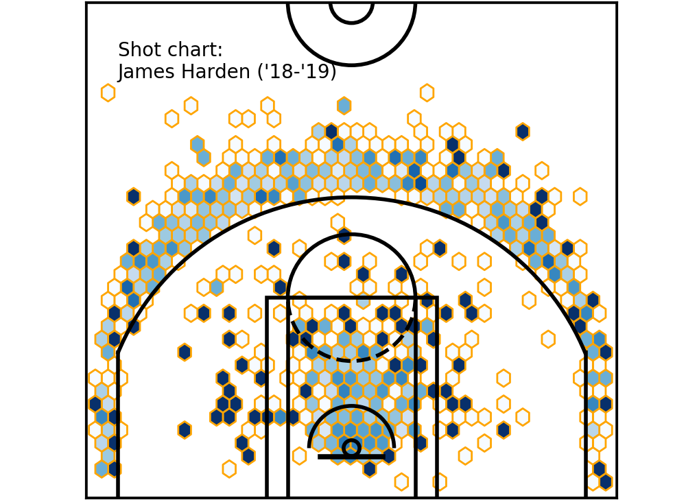 Hexbin shot chart — James Harden (‘18-’19)
Now, let’s compare it to the graph above — where we looked at the raw shot chart.
Hexbin shot chart — James Harden (‘18-’19)
Now, let’s compare it to the graph above — where we looked at the raw shot chart.
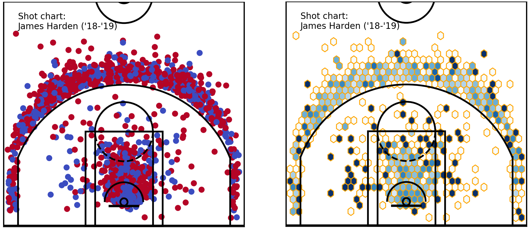 Raw & hexbin shot chart — James Harden shots (‘18-’19)
It looks much better, doesn’t it? I still notice that some of these hexagons on the right are shown as very dark (or white). Inspecting the raw shot chart, they’re likely to be single shots. Here is where we need to make some decisions as data analysts.
Raw & hexbin shot chart — James Harden shots (‘18-’19)
It looks much better, doesn’t it? I still notice that some of these hexagons on the right are shown as very dark (or white). Inspecting the raw shot chart, they’re likely to be single shots. Here is where we need to make some decisions as data analysts.
One option is to filter these out based on sample size. Much in the same way that a kid shooting and making one shot out of one in the local gym doesn’t mean anything, we might simply ignore hexbins here where we haven’t met a minimum sample size.
How could we do that? Python has a solution, of course.
Filtering hexbin data
To do this, I prefer to simply get the data that would go into the hexbins, and filter them.
Handily, the plt.hexbin function that we’ve been using actually returns an object back. So, we can actually get the summarised outputs (without the plot) by:
shots_hex = plt.hexbin(
    shots_df.original_x, shots_df.original_y,
    extent=(-250, 250, 422.5, -47.5), cmap='Blues', gridsize=40)
plt.close()  # this closes the plot window
We can now grab the values of ‘shots_hex’ hexbin with the .get_array()method, where the values are the sample size for each bin. For x & y locations, the .get_offsets() method will return them as tuples. We can use these values to filter for sample sizes (let’s say for a minimum of 5).
Also, we grab an array of percentages for each hexbin, using:
makes_df = shots_df[shots_df.shot_made == 1]
makes_hex = plt.hexbin(
    makes_df['original_x'], makes_df['original_y'],
    extent=(-250, 250, 422.5, -47.5), cmap=plt.cm.Reds, gridsize=40)
plt.close()
pcts_by_hex = makes_hex.get_array() / shots_hex.get_array()
pcts_by_hex[np.isnan(pcts_by_hex)] = 0  # convert NAN values to 0
These values can now be filtered, using:
sample_sizes = shots_hex.get_array()
filter_threshold = 5
for i in range(len(pcts_by_hex)):
    if sample_sizes[i] < filter_threshold:
        pcts_by_hex[i] = 0
x = [i[0] for i in shots_hex.get_offsets()]
y = [i[1] for i in shots_hex.get_offsets()]
z = pcts_by_hex
At this point, we have everything we need to plot this data. This time, because we have pre-calculated the x, y coordinates of each bin, and the percentage from each spot, the hexbin plots can be plotted as scatter plots. For best visual effect, we use hex markers — to remind us and the readers that we’ve used hexbins.
plt.figure(figsize=(5, 4.7))
plt.xlim(250, -250)
plt.ylim(-47.5, 422.5)
plt.scatter(x, y, c=z, cmap='Blues', marker='h')
plt.text(220, 350, "Shot chart: \nJames Harden ('18-'19)")
viz.draw_court(outer_lines=True)
cur_axes = plt.gca()
cur_axes.axes.get_xaxis().set_visible(False)
cur_axes.axes.get_yaxis().set_visible(False)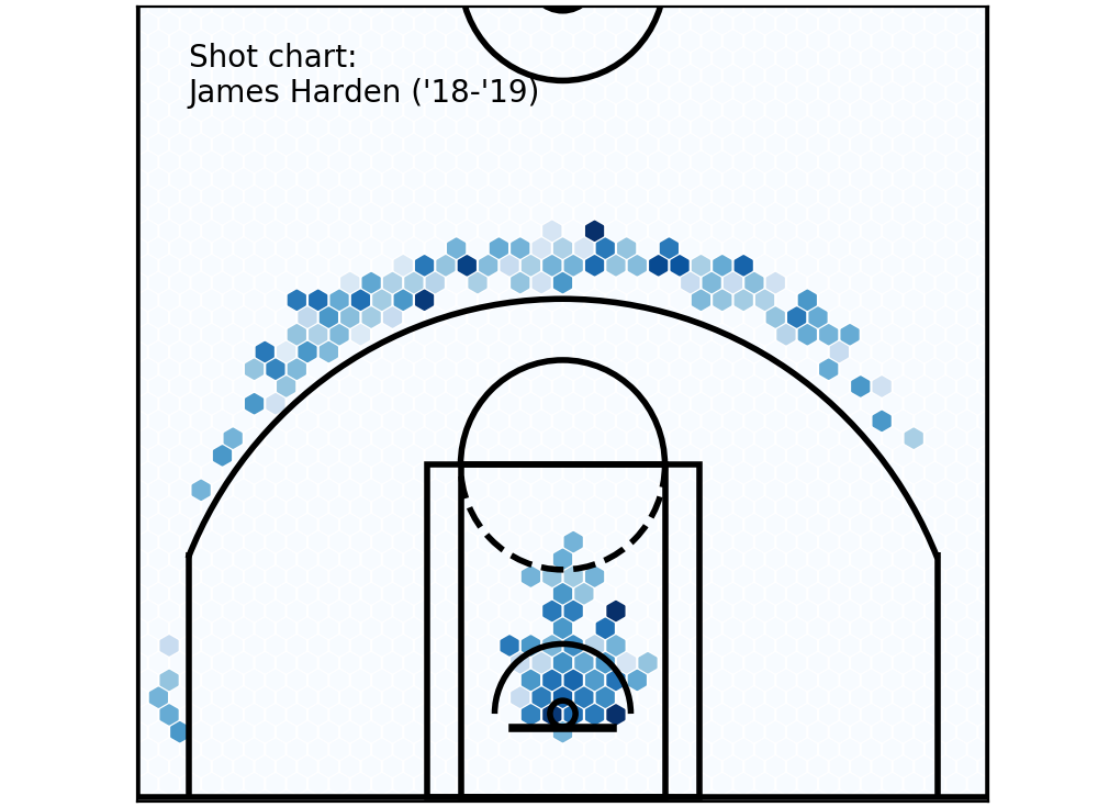 Filtered hexbins — min. 5 shots or more.
Neat, isn’t it? We see how that Harden shoots most of his 3s above the break, and the rest of his shots come from near the basket. If you’re a basketball fan, you’ll see that this is a perfect illustration of the modern ethos of looking for the most efficient shots — which are at the rim, or a 3.
Filtered hexbins — min. 5 shots or more.
Neat, isn’t it? We see how that Harden shoots most of his 3s above the break, and the rest of his shots come from near the basket. If you’re a basketball fan, you’ll see that this is a perfect illustration of the modern ethos of looking for the most efficient shots — which are at the rim, or a 3.
Comparing him against another player becomes much easier — let’s look at Harden’s chart against DeMar DeRozan’s.
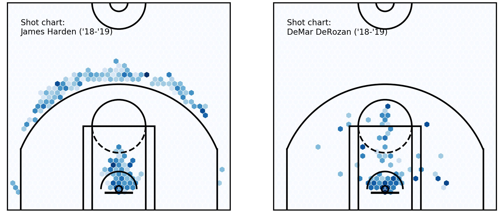 Player comparison — James Harden & DeMar DeRozan
It can be better, but we already see a great improvement over our earlier plots. These players could hardly be different — could they? DeRozan’s bread and butter really is in the midrange, and around the rim, where Harden’s shot chart is basically empty there, especially after filtering.
Player comparison — James Harden & DeMar DeRozan
It can be better, but we already see a great improvement over our earlier plots. These players could hardly be different — could they? DeRozan’s bread and butter really is in the midrange, and around the rim, where Harden’s shot chart is basically empty there, especially after filtering.
Remember this chart last week, from FiveThirtyEight?
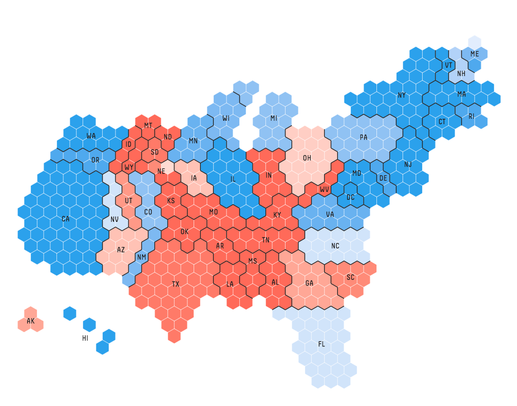 Hexbins in election coverage (Information is beautiful / fivethirtyeight)
We’ve basically re-created these, on the basketball court! Isn’t that great??
Hexbins in election coverage (Information is beautiful / fivethirtyeight)
We’ve basically re-created these, on the basketball court! Isn’t that great??
Okay. The post has gotten quite long, so let’s stop there for now, and come back to it next time.
What’s next, you ask? This, I say!
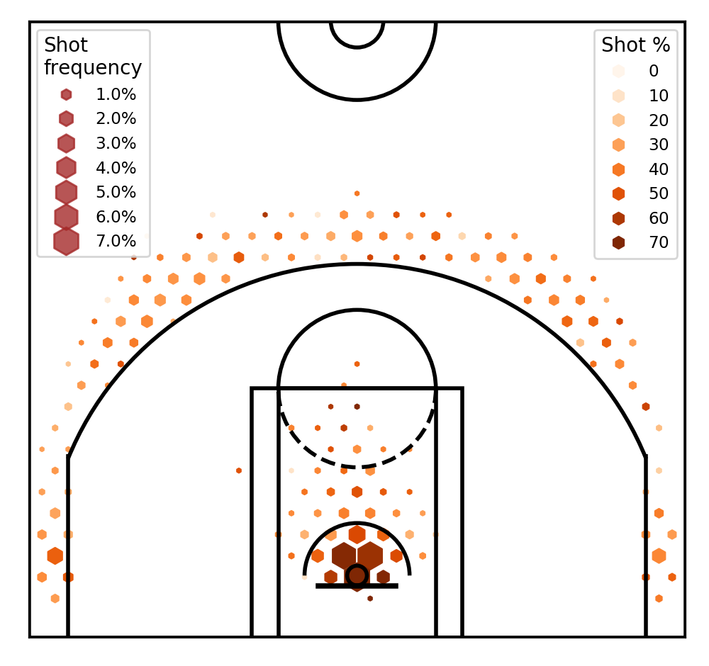
For next time!
Remember, we started with the aim of plotting four data attributes for each property. They are: x_coordinate, y_coordinate, shot_frequency and shot_percentage. So far, we’ve only created charts with three of these dimensions — the magical fourth dimension is coming next.
Also, we want to make scales of each charts consistent, plot legends, and potentially look at changing our shot percentages to relative values — say, compared to league averages. Lastly, we’ll look at analysing which teams or players stand out from the rest. See you then!
Follow me on twitter.
Cheers!