Getting the message across
This is the third article in this series - the first article talked about how to generate simple shot charts, and the second article explored about collecting that data into and plotting hexbins.
In this article, I want to talk about putting the information together to extract useful information, and then the details required to communicate it clearly.
Here’s a chart that I created earlier to illustrate a player’s impact on *defence. *I’ve added a few notes using Photoshop, but the charts more or less clearly tells you a story. Isn’t that neat?
Enter the fourth dimension
Recap & goal
By the end of the last article, you had seen and created charts like these:
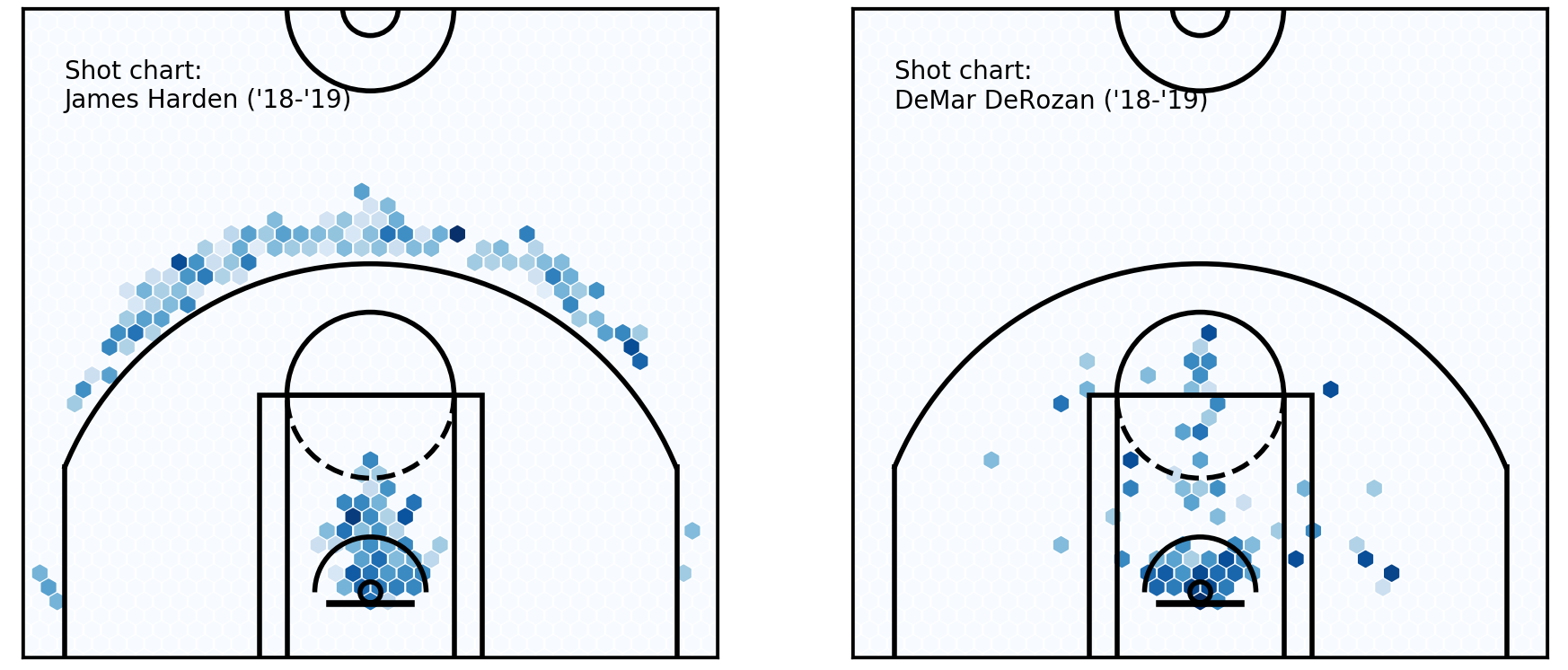 Hexbin charts
In these charts, each hexagon represents the x-coordinate area, y-coordinate area, and the average shot accuracy for all shots taken in that hexagon. It is said to encode three dimensions of information.
Hexbin charts
In these charts, each hexagon represents the x-coordinate area, y-coordinate area, and the average shot accuracy for all shots taken in that hexagon. It is said to encode three dimensions of information.
There is another, fourth, dimension that can be added to each hexagon, which will change the graph to something like the figures below:
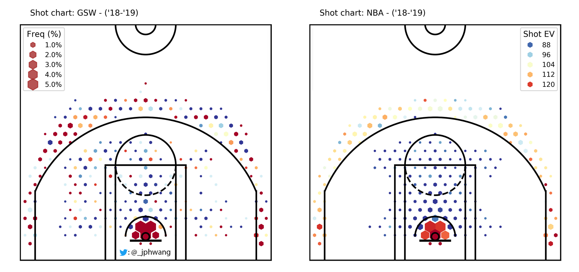 Hexbin charts - in four dimensions!
So, the size of each point (or hexagon, in this case) represents another dimension. In this case, the size of the dots represent frequency, showing how much of the total shots captured is coming from each area.
Hexbin charts - in four dimensions!
So, the size of each point (or hexagon, in this case) represents another dimension. In this case, the size of the dots represent frequency, showing how much of the total shots captured is coming from each area.
If you’ve read last week’s tutorial, you might already have a clue how this is going to be achieved. The hexbin plots were actually generated as scatter plots, and as such, it’s easy to manipulate sizes of each point to represent this fourth dimension.
A scatter(ed) approach
Code from the previous article is reproduced below to help prepare for this one (shots_df) is the pandas dataframe that contains shot data).
shots_hex = plt.hexbin(
    shots_df.original_x, shots_df.original_y,
    extent=(-250, 250, 422.5, -47.5), cmap='Blues', gridsize=40)
plt.close()  # this closes the plot window

makes_df = shots_df[shots_df.shot_made == 1]
makes_hex = plt.hexbin(
    makes_df['original_x'], makes_df['original_y'],
    extent=(-250, 250, 422.5, -47.5), cmap=plt.cm.Reds, gridsize=40)
plt.close()
pcts_by_hex = makes_hex.get_array() / shots_hex.get_array()
pcts_by_hex[np.isnan(pcts_by_hex)] = 0  # convert NAN values to 0

sample_sizes = shots_hex.get_array()
filter_threshold = 5
for i in range(len(pcts_by_hex)):
    if sample_sizes[i] < filter_threshold:
        pcts_by_hex[i] = 0
x = [i[0] for i in shots_hex.get_offsets()]
y = [i[1] for i in shots_hex.get_offsets()]
z = pcts_by_hex

plt.figure(figsize=(5, 4.7))
plt.xlim(250, -250)
plt.ylim(-47.5, 422.5)
plt.scatter(x, y, c=z, cmap='Blues', marker='h')
plt.text(220, 350, "Shot chart: \nJames Harden ('18-'19)")
viz.draw_court(outer_lines=True)
cur_axes = plt.gca()
cur_axes.axes.get_xaxis().set_visible(False)
cur_axes.axes.get_yaxis().set_visible(False)
To plot a scatter chart where sizes are representative of the frequency, the plt.scatter function can be used to map an array sizes to the s parameter, providing: plt.scatter(x, y, c=z, s=sizes, cmap='Blues', marker='h').
To get the sizes array, firstly a freq_by_hex is calculated using the .get_array method to get the number of shots per area, divided by the total number of shots.
The default sizes (which are all going to add up to 1) will be miniscule on a plot, unfortunately. So, they must be scaled proportionally so that the maximum size is 120 in this instance (the size required may vary depending on the size of your plot - check out the documentation for an explanation, I got to 120 by approximate trial & error).
Putting it together, this will plot our new, exciting scatter plot.
shots_hex = plt.hexbin(
shots_df.original_x, shots_df.original_y,
extent=(-250, 250, 422.5, -47.5), cmap=plt.cm.Reds, gridsize=25)
shots_by_hex = shots_hex.get_array()
freq_by_hex = shots_by_hex / sum(shots_by_hex)
sizes = freq_by_hex / max(sizes) * 120
plt.close()
plt.figure(figsize=(5, 4.7))
plt.xlim(250, -250)
plt.ylim(-47.5, 422.5)
plt.scatter(x, y, c=z, s=sizes, cmap='Blues', marker='h')
plt.text(220, 350, "Shot chart: \nJames Harden ('18-'19)")
viz.draw_court(outer_lines=True)
cur_axes = plt.gca()
cur_axes.axes.get_xaxis().set_visible(False)
cur_axes.axes.get_yaxis().set_visible(False)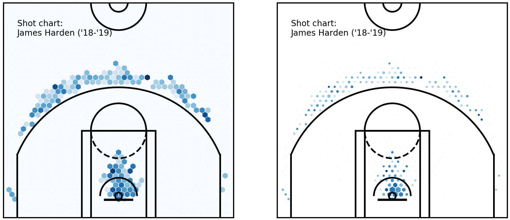 The same hexbin charts, with constant marker sizes (left) and variable sizes (right)
The chart on the right immediately communicates to the reader which spots were more frequency used by Harden throughout the season, as well as showing how effective he was from each spot.
The same hexbin charts, with constant marker sizes (left) and variable sizes (right)
The chart on the right immediately communicates to the reader which spots were more frequency used by Harden throughout the season, as well as showing how effective he was from each spot.
Clarifying information - legends & scales
The plots to date have only used standard colour scales, not manipulating the sizing data or colour scales except for specifying a maximum visual size to correspond to the divided hexbin size, and specifying a colour scale type.
As a result, it becomes difficult to view these plots and get a quantitative feel for any of these differences. If you are not sure what I mean, take a look at some of the points above. Can you tell how much better a player shoots from a darker spot than from a lighter spot, and how much more often from a larger spot than a smaller one?
Not really. Let’s fix that by working on scales and legends.
Legends
As they are, the charts do not convey any quantitative information (other than location), as there is no way for us to interpret colours back to shot accuracy, and shot frequency.
Legends can be added to our charts help visual information back into encoded information. In matplotlib, the function to use is plt.legend, which takes parameters handles and arguments, both of which are lists. Think of them as tuples of what is shown on the legend.
Luckily, as with most things, we can simply grab returned value from the matplotlib function that we are using. In this case, if we grab the returned value form our scatter plot by scatter = plt.scatter(x, y, c=z, s=sizes, cmap='Blues', marker='h'), we can simply pass *scatter.legend_elements(num=6) on to plt.legend to be unpacked, like so:
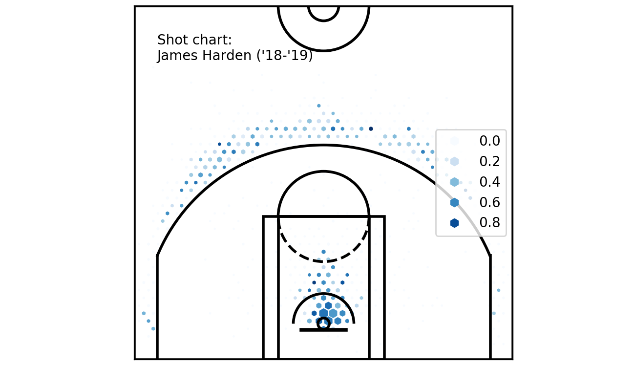 Legend!
This could be better, though. The legend could be moved to not overlap with the chart, a title added, the numbers should be converted to percentages and we would like a second scale that refers to the size of the hexagons.
Legend!
This could be better, though. The legend could be moved to not overlap with the chart, a title added, the numbers should be converted to percentages and we would like a second scale that refers to the size of the hexagons.
Parameters can be added to our plt.legend function call to sort out the first two problems. loc="upper right", title='Shot\nacc', fontsize='small' will move the legend to the top right of the figure, and add a small title.
As for the scale of the numbers, there are two options. One is to convert them to percentages before passing them into the scatter plot, like z = z * 100. Another is to use a lambda function as a parameter to the scatter.legend_elements call, for instance func=lambda: s = s * 100. Both of these will manipulate the shot accuracy outputs, multiplying results by 100. Passing fmt="{x:.0f}%" to the legend_elements call will also change the format to a percentage, with no (0) digits after the decimal point.
Putting a second legend on is a little more tricky. We can invoke another plt.legend call - however, it will unfortunately not work for our purpose, replacing the first legend.
Instead, we overcome this by calling the first legend using legend1 = plt.legend(...), and then call plt.legend again for the second legend, which replaces the first. But since we captured the returned value in legend1, we can add it back by plt.gca().add_artist(legend1). If you’d like to read more about what these calls are doing, these references (scatter with legends, legend guide) are excellent starting points.
Putting these together, we get:
plt.figure(figsize=(5, 4.7))
plt.xlim(250, -250)
plt.ylim(-47.5, 422.5)

z = pcts_by_hex * 100
scatter = plt.scatter(x, y, c=z, s=sizes, cmap='Blues', marker='h')
plt.text(220, 440, "Shot chart: \nJames Harden ('18-'19)")
viz.draw_court(outer_lines=True)
cur_axes = plt.gca()
cur_axes.axes.get_xaxis().set_visible(False)
cur_axes.axes.get_yaxis().set_visible(False)

sizes = freq_by_hex
sizes = sizes / max(sizes) * 40
max_freq = max(freq_by_hex)
max_size = max(sizes)
legend1 = plt.legend(
    *scatter.legend_elements(num=6, fmt="{x:.0f}%"),
    loc="upper right", title='Shot\nacc', fontsize='small')
legend2 = plt.legend(
    *scatter.legend_elements(
        'sizes', num=6, alpha=0.8, fmt="{x:.1f}%"
        , func=lambda s: s / max_size * max_freq * 100
    ),
    loc='upper left', title='Freq (%)', fontsize='small')
plt.gca().add_artist(legend1)
Just note that I have another lambda function here for the size (in legend2) - that is because we want to scale the sizes. I have also moved the title to be above the chart. Hopefully you’ve got a nice chart like this one:
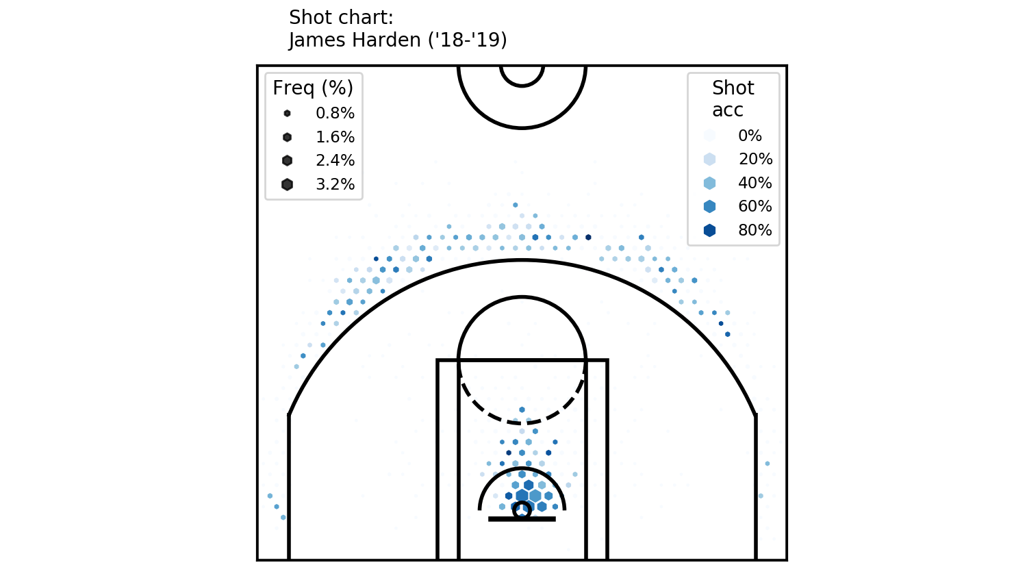 Two legends can coexist, as it turns out
Scales
As a first step, we must decide on what information we want the colour to show. The current colour scale is sequential, meaning that it goes in sequence, in one direction. It’s fine for showing data in one direction, showing which values are larger than others.
On the other hand, this is a shot chart for a professional basketball player (Harden). So, maybe we would like to see how Harden’s percentages compare to a league average.
To do this, we need to manipulate two things: one, the colour values themselves, and two, the colour scale, to a diverging scale to show direction, as well as value.
Relative colour values can be easily obtained by subtracting one array from another. Here, I calculated the league average values and called them league_pcts_by_hex, so pcts_by_hex - league_pcts_by_hex gives me the relative values.
And we would like to ‘clip’ the relative percentages, so that the maximum and minimum values are at 0.1 and -0.1 (0r 10% and -10%) respectively. I achieve that manually, by
clip_cmap = (-0.1, 0.1)
z = np.array([max(min(i, max(clip_cmap)), min(clip_cmap)) for i in rel_pcts_by_hex]) * 100
And at this point, we are dealing with sample sizes too small on each grid - so I decreased the grid size parameter to 25 and increased the sizing parameter to 150.
Put together, the code looks like this:
freq_by_hex = shots_by_hex / sum(shots_by_hex)
filter_threshold = 0.002
for i in range(len(freq_by_hex)):
    if freq_by_hex[i] < filter_threshold:
        freq_by_hex[i] = 0

sizes = freq_by_hex
sizes = sizes / max(sizes) * 120
max_freq = max(freq_by_hex)
max_size = max(sizes)

rel_pcts_by_hex = pcts_by_hex - league_pcts_by_hex
clip_cmap = (-0.1, 0.1)
z = np.array([max(min(i, max(clip_cmap)), min(clip_cmap)) for i in rel_pcts_by_hex]) * 100

plt.figure(figsize=(5, 4.7))
plt.xlim(250, -250)
plt.ylim(-47.5, 422.5)

scatter = plt.scatter(x, y, c=z, s=sizes, cmap='RdYlBu', marker='h')
plt.text(220, 440, "Shot chart: \nJames Harden ('18-'19)")
viz.draw_court(outer_lines=True)
cur_axes = plt.gca()
cur_axes.axes.get_xaxis().set_visible(False)
cur_axes.axes.get_yaxis().set_visible(False)

legend1 = plt.legend(
    *scatter.legend_elements(num=6, fmt="{x:.0f}%"),
    loc="upper right", title='Shot\nacc', fontsize='small')
legend2 = plt.legend(
    *scatter.legend_elements(
        'sizes', num=6, alpha=0.8, fmt="{x:.1f}%"
        , func=lambda s: s / max_size * max_freq * 100
    ),
    loc='upper left', title='Freq (%)', fontsize='small')
plt.gca().add_artist(legend1)

plt.tight_layout()
And it generates:
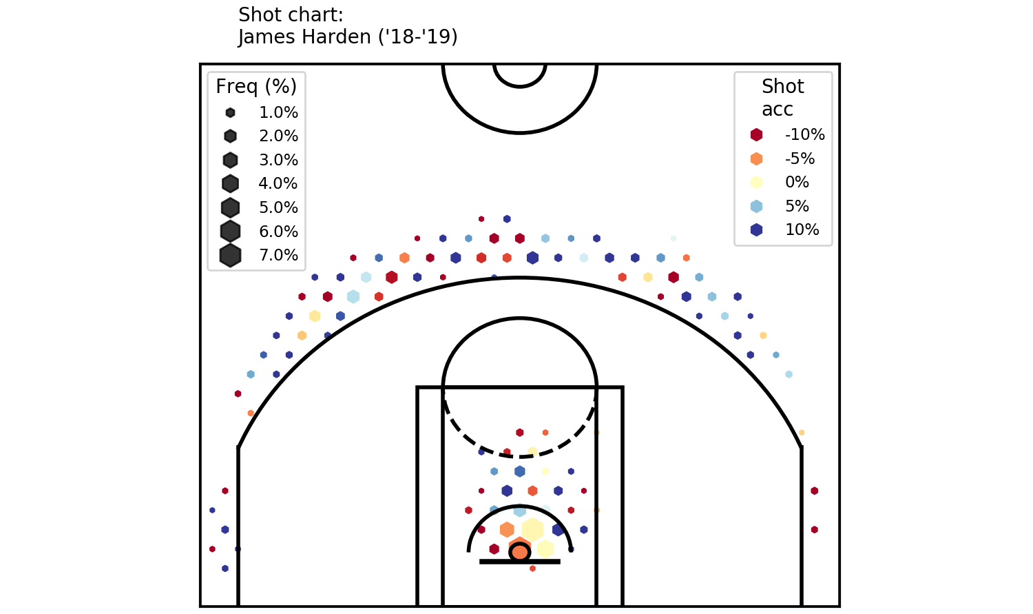 A colourful shot chart - clearly showing where Harden’s been good / bad.
Okay. That’s it from me this time. Thanks for reading!
A colourful shot chart - clearly showing where Harden’s been good / bad.
Okay. That’s it from me this time. Thanks for reading!
Follow me on twitter :)
Cheers!